Solving image resizing woes with Next/Image for faster load times
Originally published: 1 January 2024
How to fix Next/Image for faster load times and better page scores

In the world of web development, optimizing for performance is an ongoing challenge. Recently, I faced a frustrating problem with Next.js’s next/image component, which was not resizing images properly in terms of aspect ratio. This issue not only impacted the visual aesthetics of my website but also led to warnings from Google PageSpeed and Lighthouse about the load time and file size. Determined to resolve this issue, I embarked on a journey to find a solution. In this blog post, I’ll share my experience and how I managed to overcome this obstacle to improve my website’s performance significantly.
The Problem
As a web developer, I rely on Next.js for building efficient and performant websites. One of the great features it offers is the next/image component, which makes it easy to handle responsive images. However, despite using next/image, I was encountering problems with images not resizing properly in terms of aspect ratio.
This issue manifested in a few ways:
-
Aspect Ratio Issues:
next/imagewas keeping the original aspect ratio of images, which is generally a good thing. However, it meant that I had to change the aspect ratios of the raw images because the originals were 1.75 AR, not 1.5 (3:2 or 2:3). -
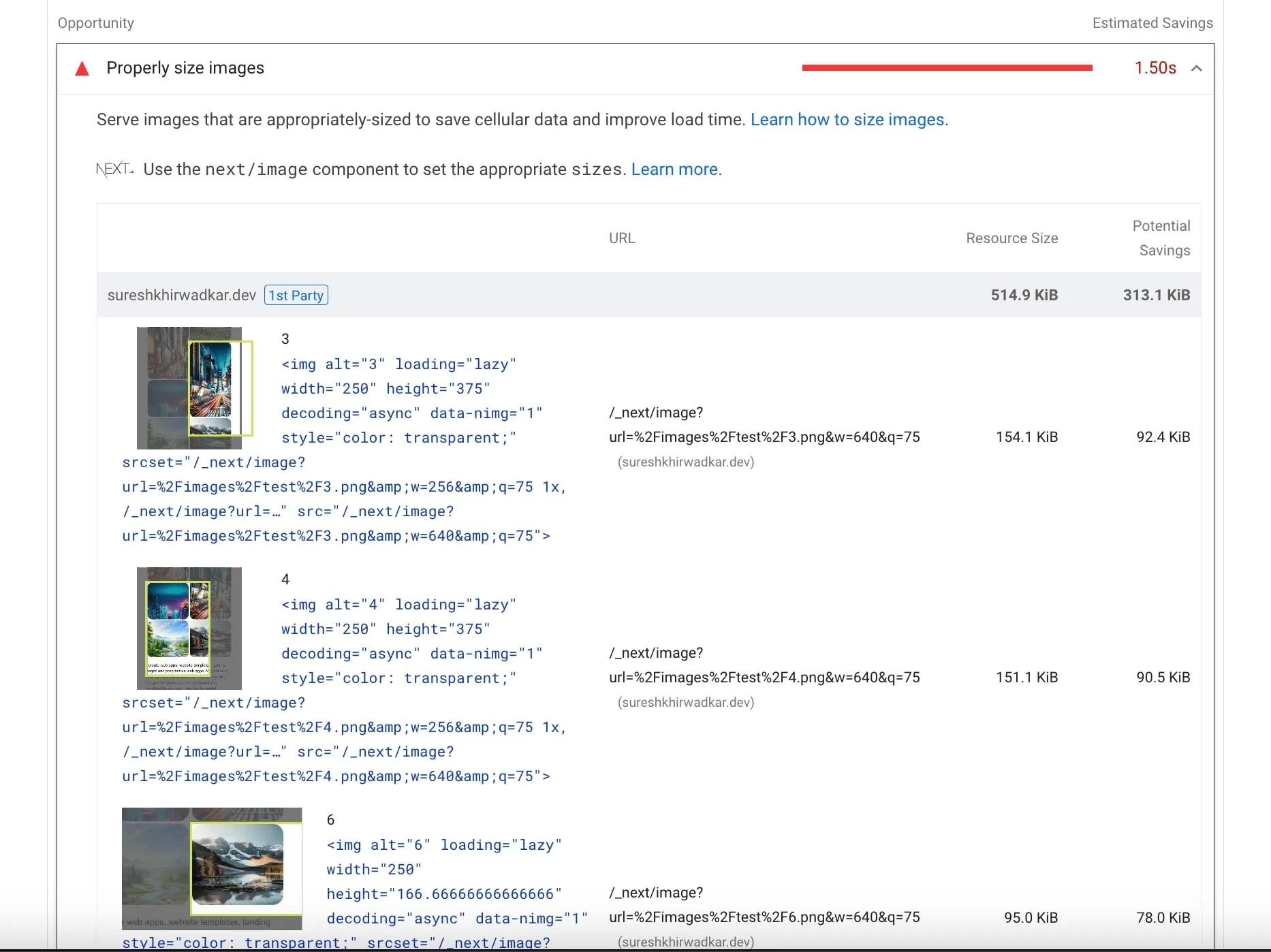
Performance Warnings: Google PageSpeed and Lighthouse were flagging my site for slow load times and large file sizes due to improperly sized images. The warnings were daunting, suggesting I could save almost 1.5 seconds off the load time and over 300KB in file size.
Finding a Solution
Determined to solve this problem, I started researching and experimenting. During my quest for a solution, I stumbled upon a valuable resource, the “sizes” attribute, which helps to define the dimensions of images in responsive designs. A specific page that proved to be immensely helpful in understanding this concept was https://solutions-reduce-image-bandwidth-usage.vercel.sh/.
The “sizes” attribute, when used in conjunction with next/image, allows you to specify different image sizes based on the viewport width. This means that images can be served in a manner that is appropriate for the user’s device, saving bandwidth and improving load times.
Implementing the Solution
With my newfound knowledge of the “sizes” attribute, I revisited my website’s image implementation. I adjusted my next/image components to include the “sizes” attribute, specifying the image dimensions for various viewport sizes. Here’s an example of how it looked in my code:
<Image
  src="/path/to/image.jpg"
  alt="Description of the image"
  width={1200}
  height={800}
  sizes="(max-width: 640px) 100vw, (max-width: 768px) 50vw, 25vw"
/>
By adding the “sizes” attribute, I ensured that the images would adapt to different screen sizes appropriately, preventing oversized images from slowing down my site.
The Results
After implementing the “sizes” attribute, the results were remarkable. The issues with aspect ratio were resolved, and my website’s load times improved significantly. Google PageSpeed and Lighthouse no longer issued warnings about slow load times and large file sizes. I had successfully shaved off almost 1.5 seconds from the load time and reduced my website’s file size by over 300KB.
Conclusion
My experience with Next/Image taught me the importance of correctly resizing images for web performance. The “sizes” attribute proved to be a powerful tool in my arsenal for optimizing responsive images. With this simple yet effective solution, I was able to enhance my website’s performance, making it faster to load and reducing the strain on bandwidth. If you’re facing similar issues with Next/Image, don’t hesitate to explore the “sizes” attribute – it might just be the key to unlocking a faster, more efficient website.
Read Count: 0
 Facebook
 Twitter
 Email
Email